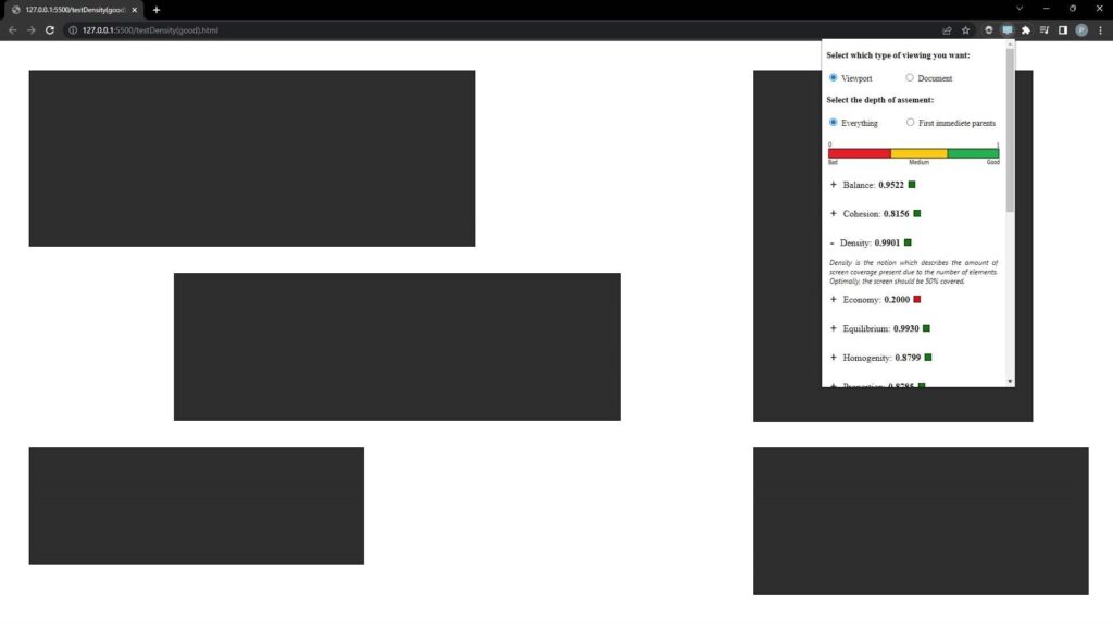
The concept of aesthetics, especially in software, is quite broad and difficult to define due to the inherent subjectivity in terms of what constitutes an aesthetically pleasing system. This study sought to mitigate this problem by investigating the use of objective metrics when dealing with the aesthetics of a webpage.
The project revolved around the development of a browser extension, named WebAesthetic, which used mathematical formulae to calculate the different aesthetic aspects of the page, based solely on what would be present on the screen. This would enable the automated assessment of aesthetic aspects within the browser environment without having to deploy a separate tool.
At the core, WebAesthetic adopts 14 aesthetic metrics, as proposed by Ngo et al. [1]. These metrics could be applied to: a) all visible elements above the fold; b) all elements on the page, including those below the fold; and c) on specific elements selected by the extension user. These metrics include aspects such as: balance, proportion, density, and symmetry, while the ‘order and complexity’ metric acts as a general metric, combining all other metrics to provide an overall aesthetic score. This provides users, typically user experience (UX) specialists and user interface (UI) designers, with a compound objective metric that would deliver an overall aesthetic score without having to delve into the detail of each individual metric.
The proposed tool also seeks to provide calculations around colour statistics, including average colour and luminosity – for different regions or for the page, overall. The values of the metrics were bounded between 0 (awful) and 1 (excellent). The tool could also issue a brief description for each metric to support interpretation.
To help designers better achieve their goals, additional functionalities targeting different aesthetic aspects present on screen were implemented. The first of these functions includes the calculation of average colour and luminosity present in different sections of the screen. Furthermore, a localised analysis mode was implemented, which would allow metrics to be calculated for individual elements in the context of their parent elements (as opposed to the whole screen). This would allow the users to evaluate and target large and complex elements, ensuring that each one would be delivered appropriately.
The study was evaluated using two separate methods. Firstly, test cases were developed for each metric, targeting every possible case, including when the metric would be neglected, promoted, and considering the selection between the screen and the viewport. The results obtained from this evaluation allowed the development to proceed to the next stage, which was to incorporate the evaluated metrics into a suitable browser extension. Secondly, in-depth expert reviews were held in order to collect feedback about the usability and utility of the extension as perceived by professionals.
Both evaluations yielded satisfactory and promising results, with various suggestions being put forward by professionals. Moreover, given that the expert reviews took place over multiple iterations, an incremental approach was adopted in the development of the extension. This approach allowed for the suggestions obtained from each iteration to be incorporated incrementally, a result of which they could be evaluated in subsequent iterations.

Figure 1. Calculating the aesthetic metrics of a test case using the proposed tool for the study, WebAesthetic
Student: Philip Paul Grima
Supervisor: Dr Chris Porter
