This project is related to the field of telecommunications. It revolves around an analysis of a number of key performance indicators (KPIs) related to telecommunications, with real-world data acquired from specialised equipment compared to a number of predictive models created in this project.
The signal strength across a number of points was predicted using three main predictive models. MATLAB, which is a program used to model many engineering scenarios, was used in order to help
generate such models. An analysis on the predicted values was conducted, to establish which model performed best. A post-analysis model-fitting exercise was also conducted on different sets of points, so that each model would better ‘fit’ the real data. All the data that was collected and modelled was then displayed on a GIS (geographic information system) web-based portal. This GIS portal consisted of an interactive dashboard displaying all the information that was gathered
during this exercise. This dashboard consisted of all the predictive data pertaining to individual predictive models, as well as the real-world data. This also provided insight into the models generated, and one could easily compare the results produced.
A web server was also set up and linked to a geographical database, where information related to the analysis conducted would be stored. Apart from displaying the data collected on a web portal, a statistical analysis was also carried out between the outputs of various predictive models, to determine which model performed better. A number of statistical parameters that proved to be of interest were the mean square error, which could analyse how close the data points would be to one another, as well as the Pearson correlation co-efficient which calculates the closeness between two related sets of data.
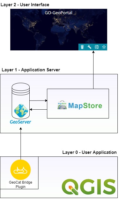
the system implementation. The bottom layer shows the application
we will use to edit geographic data, with level 1 showing the web
server and the top-most layer showing the web portal, where data will
be represented
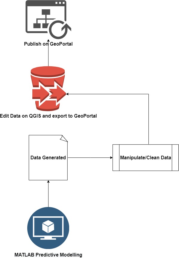
detailed view on how the data is generated and then manipulated,
before eventually being published on the web GIS or ‘geoportal’
Student: Kristian Fenech
Course: B.Sc. (Hons.) Computer Engineering
Supervisor: Prof. Saviour Zammit