This project set out to address risk-landscape visibility and management in software development projects. Risks are best defined as unpredictable occurrences that could have a negative impact on the project’s objectives. Virtually all software projects would entail some level of risk, which could materialise at any point during the development process of a project. The said risks tend to affect cost, schedule, technical performance, time, people, among other elements. It has been noted that, the larger the project, the greater the number of risks that may arise, which in turn would render the particular software project more difficult to manage.
Research shows that software development companies consider risks to be a primary issue of concern. However, these are issues inherent to the current approach to risk management. This includes: inaccurate measurement of identified risks; the inability to communicate risk information; and the inability to maintain an accurate and efficiently descriptive picture of the project’s risk landscape.
This project has explored these issues in an attempt to address them by introducing data visualisation coupled with a decision-support system in relation to risk management. Data visualisation is the process of displaying data in a graphical or pictorial style to facilitate understanding. It has been observed to address many of the issues relating to the presentation of the risk situation, based on available project and resource data. Research has also shown that visualisations could efficiently represent data coming from several sources, facilitate the communication and discussion of issues/items, and support the selection of actions. While there are many types of data visualisations that could be utilised, research points towards the use of heat maps as a particularly useful diagrammatic form applicable to the context of risk. Heat maps are used to display information on a colour-coded grid to represent the level of risk where, the higher the risk, the more intense the colour.
The user of the proposed solution would be required to input some fundamental information for the purpose of a predefined list of risks, such as the probability for the respective risks to occur (referred to as the likelihood), and the negative impact that would be envisaged should the respective risk(s) occur (referred to as the severity). The solution would then present the risk landscape as a heat map (based on the information provided) for the current phase of development. The decision support system seeks to support project managers in making decisions by predicting how risks could evolve through a project. It could also prove useful to the project manager in understanding the balance, in terms of cost, between risk mitigation and risk allowance. This would assist project managers in better managing risk investment.
By introducing data visualisation, along with a decision support system based on a degree of automated support, the solution described above promises to adequately improve risk management processes ‒ and consequently overall software project quality. The proposed solution would reach its full potential by combining it with existing human experience and judgement.
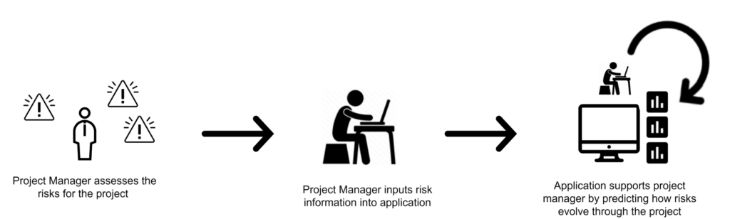
Figure 1. Overview of how the proposed tool could be used in the risk management process
Student: Jeremy Calafato
Supervisor : Prof. Ernest Cachia